
Why is using the right formats essential for your visual identity?
A visual identity is much more than just a logo
When we talk about visual identity, we often think of the logo, and sometimes the colors.
Rarely do we think of the files.
And yet, it is usually the formats that make all the difference between a professional visual identity… and a messy, blurry, or poorly executed image.
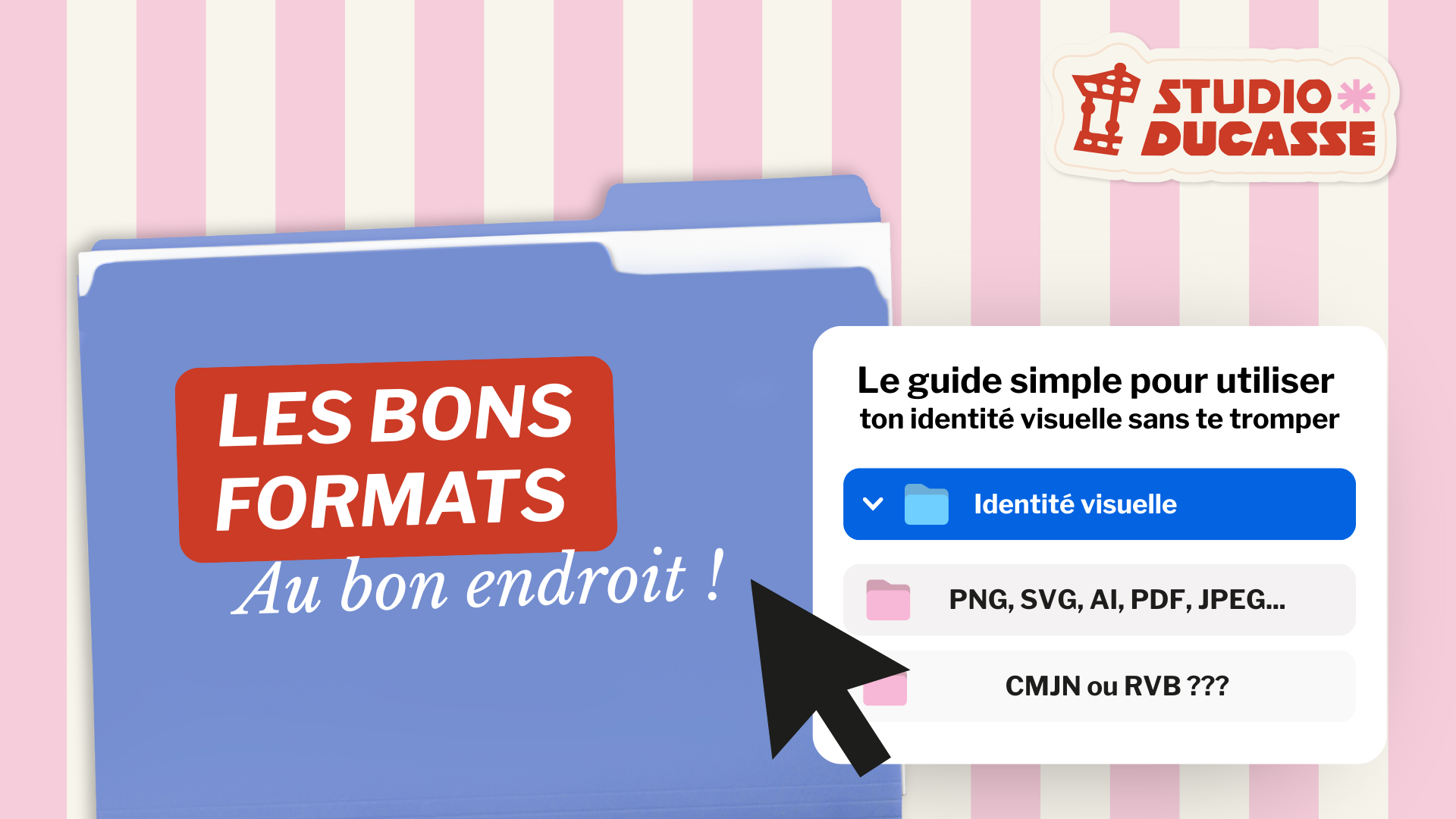
PNG, JPG, PDF, SVG, RGB, CMYK…
These terms can quickly make it seem like you need to be a graphic designer to figure it out.
Spoiler: no.
In fact, understanding the basics of your visual identity allows you to:
avoid common mistakes
save time
maintain the quality of your brand image
In this article, we explain why formatting is so important and how to use it correctly—without any unnecessary jargon.
1. What is a visual identity (really)?
A visual identity isn't just a logo sitting in a folder.
It is a comprehensive graphic system designed to work across all your devices.
It includes:
A main logo
Variations (horizontal, vertical, icon, favicon, etc.)
A color palette
Fonts
Files and formats tailored to every need
Each element has a specific function.
And above all: each element must be used in the right context.
💡 In short: a well-designed visual identity that is poorly executed immediately loses its impact.
2. Why are file formats so important?
🚫 “I have a PNG logo—that’s all I need.”
➡️ False.
Each file format is designed for a specific purpose.
Using the wrong format can result in:
a blurry or pixelated logo
colors that appear altered when printed
an unprofessional appearance

3. The most common formats (and their actual uses):
This is one of the most common misunderstandings.
An image file (PNG, JPG) is made up of pixels.
A vector file (AI, SVG, vector PDF) is composed of mathematical shapes.
Result:
An image loses quality when it is enlarged
A vector remains clear regardless of its size
4. Why should a logo always be in vector format?
Because it is intended to be used on:
a sign
textile flocking
a large-format poster
a variety of printed materials
Without a vector file, your logo is limited.
And often… underutilized.
👉 Common mistake: enlarging a PNG → blurry logo → unprofessional-looking image.

5. Colors: RGB, CMYK… why do they never look the same?
Another common misunderstanding:
“Why do my colors look great on screen but dull on paper?”
The answer is simple:
RGB = colors for screens (web, social media)
CMYK = colors for printing
Screens work using light.
Paper works with ink.
Conclusion: A well-executed visual identity is one that stands the test of time
You don’t need to become a graphic designer.
You just need to understand the basics to use your visual identity effectively.
To learn more, we’ve created a free, practical, jargon-free guide that explains:
Which file should I use?
When to use it
and why